Looking for a website design company that can build your mobile friendly website? Ventura Web Design & Marketing specializes in mobile web design for WordPress and eCommerce.
👉 Do you need a responsive website built for your business? Trust the experts at Ventura Web Design. Contact Us now to discuss your project.
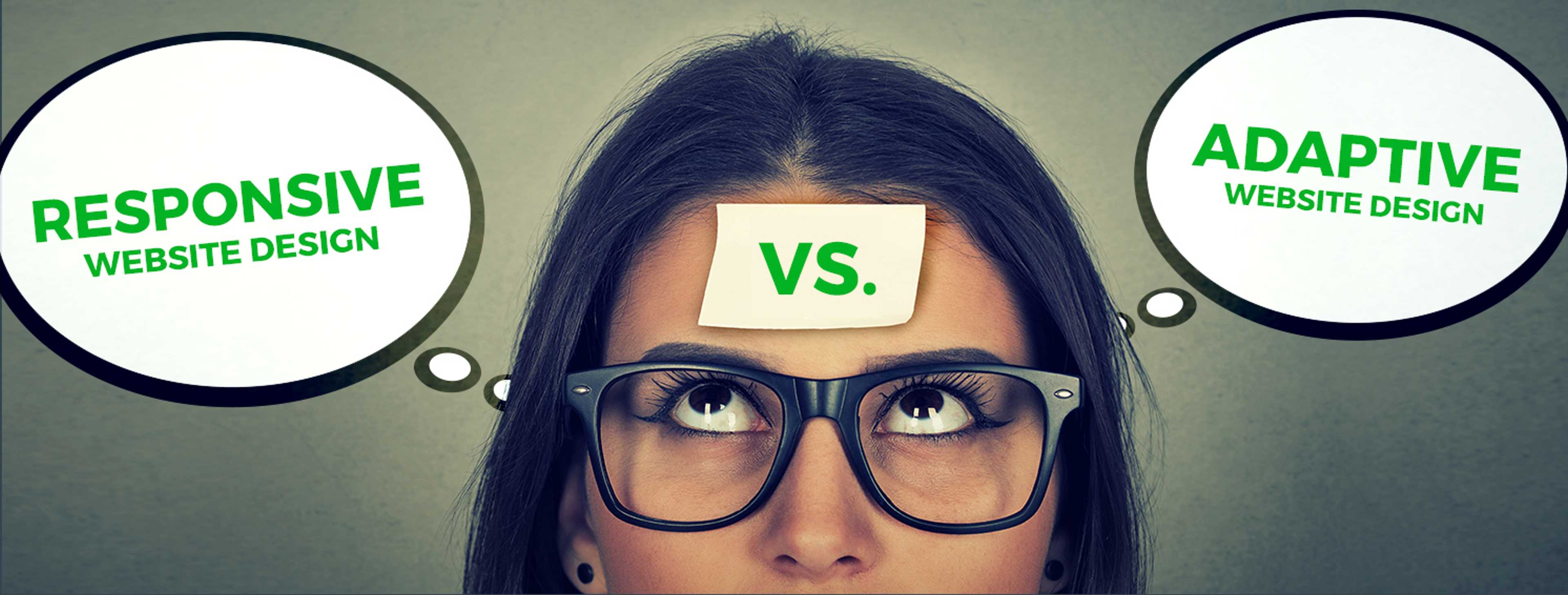
Should My Online Store Use Responsive, Adaptive, or Mobile-First Web Design?
The way people browse the web today is rapidly changing, more and more people are using their phones exclusively as their computers, foregoing the traditional laptop or desktop computer. For these people and many other who browse the web on their mobile device, a traditional web site designed for the desktop will no longer make the cut. In fact, Google recently made an algorithm change in their mobile search results penalizing website that aren’t designed for mobile devices and promoting mobile ready sites. The trend from desktop to mobile computing shows no signs of slowing down, if anything, the trend of moving towards mobile is speeding up.
You can check the mobile readiness of your site by visiting Google’s Mobile-Friendly test site. If your site fails the test you may be losing valuable visitors and potential clients from your site. A professional web agency can help you interpret the results of a test like this and determine what can be done to improve your scores.
Now is the time to update your site, make it mobile friendly, and win back those lost visitors. What is a phone ready website design called? There are two different types of mobile friendly (phone ready) design: Responsive or Adaptive.
With responsive design the web site is designed to expand and shrink depending on the size of the screen the user has the design itself is fluid. Adaptive design also called progressive enhancement is more like having two completely separate web sites, one that is designed for mobile screens and on for laptops or desktops. There is a debate among designers and developers over which method is better for building your site, and both methods have their positives and negatives. See below for the advantages an disadvantages along with examples of mobile web design we’ve done for clients.
Responsive Design
With responsive design the layout of your page grows or shrinks based on the resolution of the screen the user has. Images will grow and shrink to fit the space and text and other elements will flow to fit as the space either grows or shrinks.
Responsive design is a powerful tool in the modern web designer‘s arsenal as it allows an optimized viewing experience for users no matter what device they are using to access your content. Responsive design works by using a combination of HTML, CSS, and JavaScript to determine the size of a user‘s screen and display the page accordingly. This means that images, text, and other elements will automatically resize based on the user‘s device, allowing your page to look great no matter what device it is being viewed on.
Furthermore, responsive design can be used to create custom layouts for different types of devices. For example, if you have an e–commerce website you can create a layout optimized for tablets and desktops that displays more content than the layout optimized for mobile devices. This way your users will have the best possible experience regardless of what device they are using. Additionally, responsive design can help improve SEO since search engines like Google take into account how mobile–friendly a website is when ranking sites in their search engine results pages (SERPs). By having a responsive website you can ensure that your site will be highly visible in both desktop and mobile SERPs.
Advantages
- Faster development times: You only need to develop one site that will fit multiple devices, this cuts down on development time.
- Less maintenance: By their nature responsive sites are less complex than adaptive. If you need to make a change to the site, you only need to make one change. In adaptive you might need to make changes in more than one spot to make sure they design changes carries over to mobile.
- Google currently recommends a responsive design pattern.
- Future proof: Okay, nothing is really future proof, but by their nature, the flexibility of responsive sites will fit more screen resolutions. Most adaptive sites are designed to fit a desktop device and a mobile device, many leave out tablets serving a tablet either a mobile version of the site or a desktop version. With responsive web design the site will look good in a tablet such as an iPad.
Disadvantages
- Responsive redesigns are more expensive than Adaptive because they require additional work. But once complete, Responsive requires less maintenance than an Adaptive site, producing a long term overall savings in web development fees.
- When you choose to make your site Responsive, you will need to redesign your entire site and not just add a mobile template. This is usually a benefit, as your mobile and desktop sites will both match and look great, creating a consistent user experience.
Adaptive Design
Adaptive website design is like having two completely different web sites, one designed to fit on your phone the other designed to fit on your desktop. Using JavaScript and other elements different version of you site are served to the user depending on what type of device they are on.
Generally, it a great way to ensure your website looks good and works properly regardless of what device your viewer is using. Using JavaScript or other elements, the website will detect the size of the screen and deliver a tailored version of it that fits perfectly on that viewing platform. This way, you can ensure that users have a consistent experience across multiple devices, whether it be a small mobile phone or a large desktop monitor. Not only does this make for an enhanced user experience, but it also helps to improve SEO rankings because search engines can more easily index your website‘s content when it is optimized for various devices.
Adaptive design also helps to reduce development time since you don‘t need to create separate websites for different devices, just one that adapts itself automatically to fit any screen size. In addition, by using responsive images and adaptive media queries, you can ensure that all visual elements are correctly rendered on any device regardless of its size.
Advantages
- Since you are basically building a separate site from your desktop site images, logos, and other bandwidth and resource intensive processes can be left out of the mobile version of your site or better optimized for mobile, leaving you with a faster and leaner site. You only need to use the assets you think are most important to your user.
- No need to redesign your current desktop site. If you are happy with your current desktop site, you can leave it as is and develop a second mobile version.
- You can provide a link to the desktop version of the site to let the user choose what version of the site they will see.
- The design can be specifically tailored to mobile devices. With responsive design, one design needs to work with all devices, with adaptive design you can design specifically for mobile phones.
Disadvantages
- Longer development times: You have to develop for both the desktop and mobile. In some cases, depending on the platform, they may have completely separate templates for the desktop and mobile, so in essence you are developing two different sites.
- More maintenance: If you want to update the desktop site you may also need to make changes to mobile site as well. Adaptive sites are generally more complex than responsive sites.
- Many adaptive designs are desktop or mobile only, leaving out the users on tablets, who usually will either see the mobile site or the desktop version.
Mobile-First Web Design
Mobile first web design is a concept that website designers will think about and design for users on iPhones and other smart phones as their primary user base. This approach is unique because the first devices used to access the Internet were desktop and laptop computers. As smart phone usage became ubiquitous, starting as far back as the year 2014, web designers took notice of this trend and began rethinking how they designed websites.
Mobile–first design is a unique concept that takes into account the increasing prevalence of smart phones for accessing the Internet. This approach looks at designing a website with mobile users in mind first and foremost, ensuring an enjoyable experience for them on any device. This includes creating an easy–to–navigate layout with larger buttons and links, making sure the content is readable on a small screen, and optimizing loading times. In some cases, web designers may even opt to focus exclusively on mobile users instead of creating one website for all devices.
Beyond providing better user experiences, mobile–first design can also help improve search engine rankings by optimizing content for both desktop and mobile devices. As such, it has become increasingly popular among website designers looking to reach more people and increase their online visibility. With this approach, websites are designed specifically for mobile users, making them more accessible and providing a better overall experience for them.
Advantages
- The design looks cleaner and is much easier to read.
- Sites are put together in a more linear, top to bottom format. This makes it easier for your web design and marketing team to tell the story in a logical and comprehendible way.
- Websites built for mobile first can be designed with fewer images and other rich media that sometimes slow down the website experience.
Disadvantages
- Your website team may ignore the desktop design altogether, or not put as much effort into it as they should when building out this side of your website.
- The linear layout of the site makes it more difficult for those users who prefer to skim a website, rather than read it thoroughly.
Should I use mobile first design on my new website?
Mobile first means that the mobile experience of your website takes priority when strategizing. We design the mobile version of your website first, instead of starting with the desktop version. This assumption is based on the fact that more and more users are accessing websites from their mobile or smart device, rather than a laptop or desktop computer. It‘s important to consider who your audience is and how they may be discovering you in order to tailor the best experience for them. That‘s why this mobile–first approach is essential. Not only does it ensure your website is optimized for mobile users, but it also provides an opportunity to exceed their expectations.
By taking the time to create a great mobile experience, you can ensure your website stands out and provides a great user experience no matter how they‘re accessing it. In this model, we assume that the majority of your users will visit your website from a mobile or smart device, instead of a laptop or desktop computer. With the pervasiveness of smart phones, it’s more important than ever to evaluate who your audience is and how they’ll most likely be finding you.
Ventura Web Design CEO, Kevin Richards, says that mobile first web design is a piece of the larger marketing puzzle.
“As you’re putting together your new website, it is important to spend time on your strategy. Who will use your site? Why will they choose you over others? If we answer these questions during the strategy phase of your project, we can ensure a much higher likelihood of success.”
If you believe, or the data shows, that your customers will primarily access your website from a mobile device, then you should absolutely invest in a mobile first web design and strategy session with your web design company. While you’re here, why not contact us and see if we’re the right fit to help with your web project.
Ready to go Mobile Friendly?
If you‘re looking for a beautiful, responsive website that will engage and convert your customers, you need look no further. Our team of experienced web designers are dedicated to creating stunning websites that are optimized to maximize conversions. With our professional designs and attention to detail, we can help you take the next step in your business.