
Ecommerce Agency
We Design, Build, and Grow
Amazing Ecommerce Websites
Take your business to the next level by working with our eCommerce, website design, and marketing teams.
Web Design
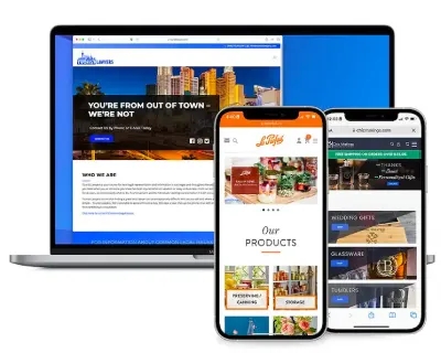
Ecommerce Web Design Services
Our web design company specializes in design and development on eCommerce platforms such as BigCommerce and Shopify. We create custom, responsive, and user-friendly websites, ensuring your online presence is both captivating and functional.
Responsive Web Design
Guaranteeing optimal viewing across all devices.
Ecommerce Expertise
Specializing in bespoke website designs for online stores.
User-Friendly Interfaces
Focused on creating intuitive and engaging user experiences.
Customized Aesthetics
Tailoring the look to reflect your brand identity.
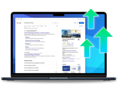
SEO
Search Engine Optimization
As a professional seo agency, we are committed to enhancing your website’s online visibility and ranking. Closely following Google's Search documentation, our SEO services are designed to help relevant users find your content. We employ a range of strategies, including local seo services and comprehensive seo audits, to help your business achieves its full potential in the search engine results.
Organic Traffic Growth
Maximizing visibility in search engines.
Local SEO Expertise
Specializing in geographically-targeted SEO strategies.
SEO Audits
Conducting thorough examinations to identify optimization opportunities.
Custom SEO Plans
Tailoring strategies to align with your business objectives.
VIP Support
Premier eCommerce Management Services
Our VIP Support program offers a comprehensive solution for all your eCommerce needs. From ecommerce management services to technical support, our team ensures your online store operates smoothly. We provide expert ecommerce management and a range of services to keep your site updated, secure, and performing at its best.
Get a New Look
Professional Graphic Design services can be the difference between a sale or an empty cart. We’ll make sure your design is up to date!
Retain Customers
Email Marketing services will allow you to reach out to your customers or leads. Let them know you’re still around and what’s new in your world.
Gain Followers
Social Media services gives you another platform for everything from customer support to sales. Are you utilizing social media?
Add Features
Programming services are available anytime you need to add features, improve security, fix errors or optimize page load speed.
Boost Conversions
Merchandising services are designed to improve sales by optimizing your item listings, product pages, sales funnels, and calls to action.
Be Found Online
Search Engine Optimization services means your site will be set up to be found on Google, expanding your reach to new customers and leads.
Expert Consultations
We’ve got experts in each area of the industry to offer insight and guidance. Not sure about the best direction? Ask us anything!
Save Time & Effort
You’ve got a full-service, U.S. team at your fingertips. Let the experts do their thing and don’t stress, you’re saving money and time!
“Thank you again for all of you do for our company. We have been together for a while now and I want to give you a big "shout out". You have no idea how much it meant to me that you answered your cell phone the other night, after hours, to fix a problem I was facing with the website. You guys rock. Also, our sales have almost doubled in the past 2 years and I give you a lot of the credit. You are always watching our website, tweaking our designs and doing quality social media posts. So, for anyone reading this, Ventura Web Design is the real deal and a great company. Become a VIP with them and you will not regret it.”

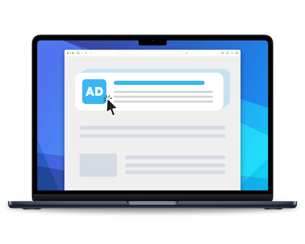
Google Ads Management
Expert Google Ads Agency
As a Google Ads agency, we create impactful PPC campaigns tailored to your business’s unique needs. Our Google Ads management agency focuses on maximizing your return on ad spend (ROAS), ensuring your brand stands out in the competitive digital advertising space.
Tailored Campaigns
Customized PPC strategies for maximum effectiveness.
ROI Focused
Concentrating on strategies that offer the best return on investment.
Comprehensive Management
From campaign setup to ongoing optimization.
Data-Driven Decisions
Utilizing analytics to inform and improve campaign performance.
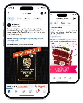
Social Media Marketing
Engaging Social Media Marketing
Our social media marketing services are designed to connect and grow your audience on platforms like Facebook, Instagram, and Twitter. We create custom strategies to enhance your brand’s online presence, focusing on engagement and conversion.
Platform-Specific Strategies
Tailoring content for each social media channel.
Audience Engagement
Creating interactive and appealing content to engage users.
Brand Awareness
Boosting your brand’s presence and reach on social media.
Conversion Tactics
Implementing strategies to turn followers into customers.
Email Marketing
Comprehensive Email Marketing Agency
We are an email marketing agency that specializes in creating targeted and personalized email campaigns. We focus on direct engagement with your audience, crafting emails that drive results. From newsletter design to campaign analytics, our services ensure your email marketing strategy aligns with your business goals.
Targeted Campaigns
Personalized emails tailored to your audience’s preferences.
Strategic Planning
We develop comprehensive email marketing strategies to achieve your goals.
Design and Content
We create engaging content and appealing designs to drive conversions.
Performance Analysis
We analyze campaign performance to optimize your email strategy.
Testimonials
What Our Customers Are Saying
“I wanted to share the awesomeness of Kevin and Ventura. I just had an amazing meeting. He was so helpful in explaining IT lingo, software vs hosting, visibility, etc. He went to my customer’s website and diagnosed the issues we are facing with fraud and enlightened me on WooCommerce and the differences in some of these platforms. Kevin also gave me recommendations of ways to address those issues, as he put it…”I have a quick answer to your problem”, or “I have a really great answer to your problem!” He will also provide a strategy on how to pitch to the customer based on the culture of the business.”

“I have had the opportunity to work with Ventura on a few projects and the team always provides great insights and direction. I would have no issue in recommending Kevin with any of my customers or prospects.”

“Kevin is the consummate professional. Many web store owners that I have come to speak with highly recommend Ventura Web Design and continue to work with his team to grow their ecommerce business. We recently collaborated on a speaking panel and we worked thru the topic and logistics without missing a beat.”

“You are making an impact already! We look forward to great growth with you and your team.”

“I will definitely continue to position Ventura Web Design to my customers.”

“Ventura did awesome work for Memphis Grindhouse Coffee. Ventura provided step by step guidance on how to create a better customer experience through the website redesign. I recommend Ventura to any ecommerce business due to their extensive knowledge and experience with increasing traffic for ecommerce businesses.”

“Kevin and the team at Ventura are so easy to work with. Thank you Ventura!”

Ready to get started?
We can't wait to help you grow your business. Our team is ready to help you achieve your goals. Contact us today to get started.